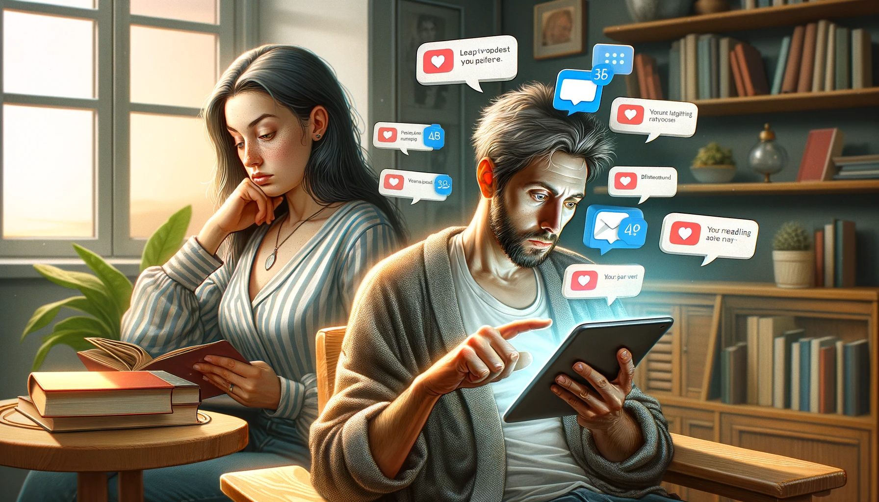
My wife and I recently switched our long-standing newspaper subscription to the digital edition (i.e., an e-newspaper). We both bring a tablet to the breakfast table. Here are some of our observations after a few weeks of daily reading.
The biggest change is that we can both have the entire paper, rather than one of us having the front page and the other having the inside section.
Our paper has two different digital editions. One is more like a web page, and the other shows a replica of the print edition. The web version is harder to scan, and the nav menu is a little confusing because it organizes articles differently than I’m used to. It also has a lot of ads, and the ads are far more intrusive on the web version. Also, it’s harder to tell if any particular article is from today or sometime in the past. Things seem a little more jumbled together.
When it comes to magazines, I don’t like “replica” editions. This is especially true for those with annoying skeuomorphs, like playing a sound when you turn a “page.” But with the e-newspaper, the replica edition works. It preserves the print layout, which I’m accustomed to, but allows you to click into an article – which then shows up in a side window.
I prefer that version for two reasons. First, it’s much easier to scan the paper, especially since I know what sorts of features are likely to show on what page. It gets confusing when they’re all mixed up. Second, I know that all the articles are from today without having to check the dates.
Both e-editions are a little harder on the eyes, but since the wear and tear of screen use is a well-known problem, I hope Silicon Valley will solve that before too long. IOW, it’s not unique to e-newspapers.
A print newspaper is easier to “navigate” than either e-newspaper version. It’s tactile and physical, and that’s the way our minds and bodies work. It also doesn’t require batteries! The “replica” edition mimics the print paper in a helpful way, particularly when you’re in landscape mode. Having a replica of the newspaper on the left and the text on the right is very easy.
My wife disagrees. She doesn’t use the article view and actually reads the replica edition of the paper on her tablet. She also reads in portrait mode while I read in landscape – which makes it easier to keep the replica on the left and the article on the right.
Another benefit of the e-newspaper is that you can make the text bigger! It’s also easy to share articles to social media (if you’re into that sort of thing), and they have a “text to speech” function which is kinda cool. You can listen to Hal read the article while you’re cooking your eggs.
The web format provides other opportunities the replica edition doesn’t have, like the ability to comment on an article, do a Sudoku, etc. But I don’t particularly care about those things. It also has links to their podcasts, which is a nice feature.
However, the web version annoyed me with a pop-up offer to subscribe to an e-newsletter I already get. C’mon people! Don’t you have a Customer Data Platform!
Overall, I like the replica e-newspaper better than I thought I would, but since I don’t have to go fetch the paper in the morning, it means some days I never leave the house!


